Genial Credit Card
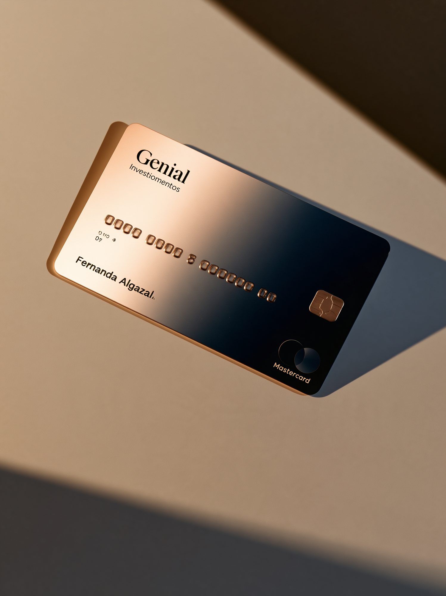
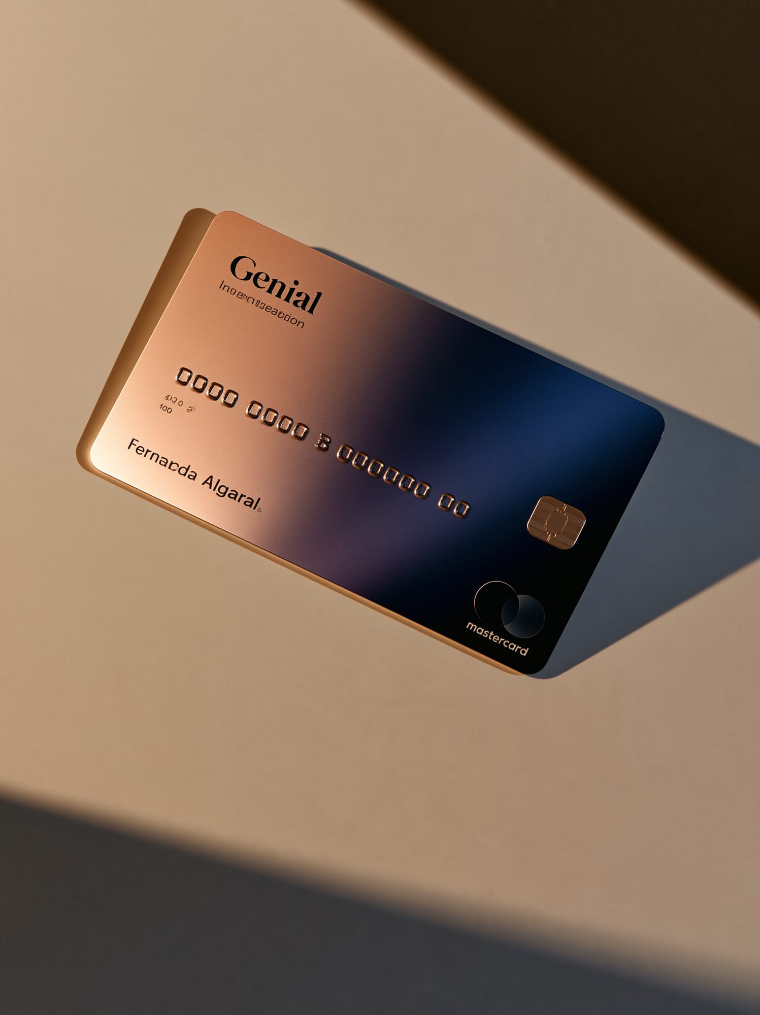
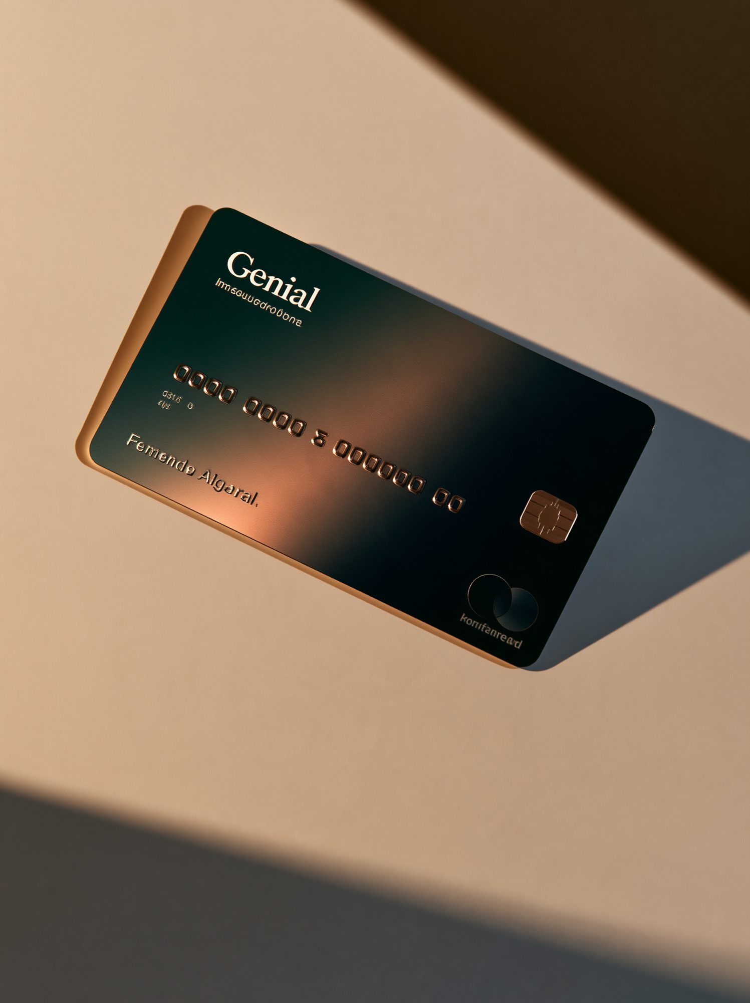
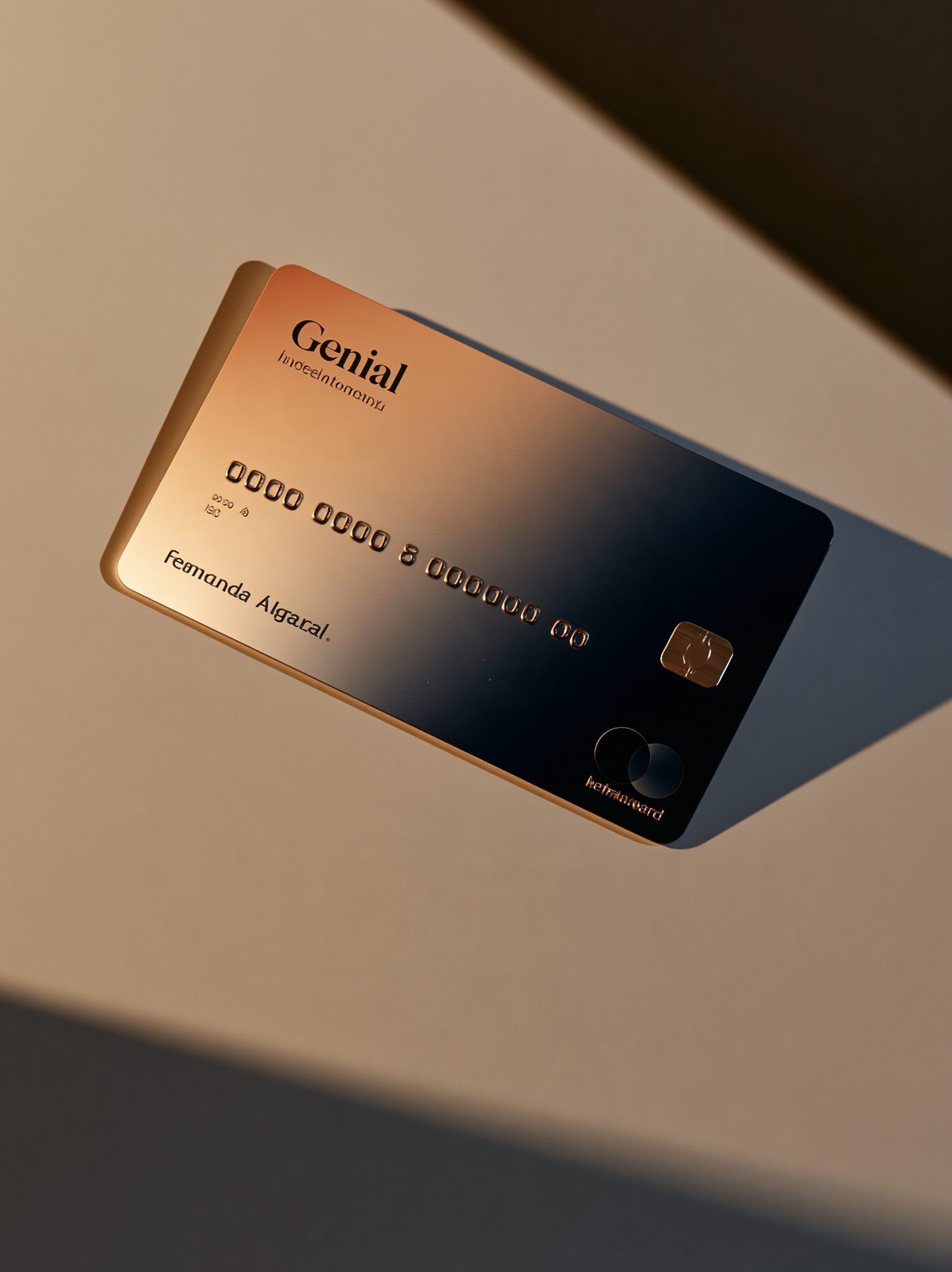
Genial's first credit card, from the object to everything around it: a Mastercard-format card built on a navy-to-neon gradient, and the request, limits, family and unboxing experience that turned an investment product into a lifestyle one.
Client
Location
Category
Year

01. The Challenge
In 2021 Genial Investimentos was launching its first credit card, issued with Mastercard. For an investment house the card was more than a new product: it was the first thing the brand would put into a customer's hand, and the first time Genial would compete on the same shelf as the digital banks its customers already carried. The physical layout had to work within Mastercard's proportions and placement rules, which fixed most of the surface before design began. What remained open was the part that mattered: which colours would make people want the card, and who those people were.
The card was also a strategic instrument. Working with the company, the project doubled as a marketing exercise to understand Genial's leads, who was arriving, who was worth pursuing, and where the company wanted to be in five years. The object had to speak to the customers Genial already had and, at the same time, to the ones it was trying to attract.
02. The Solution
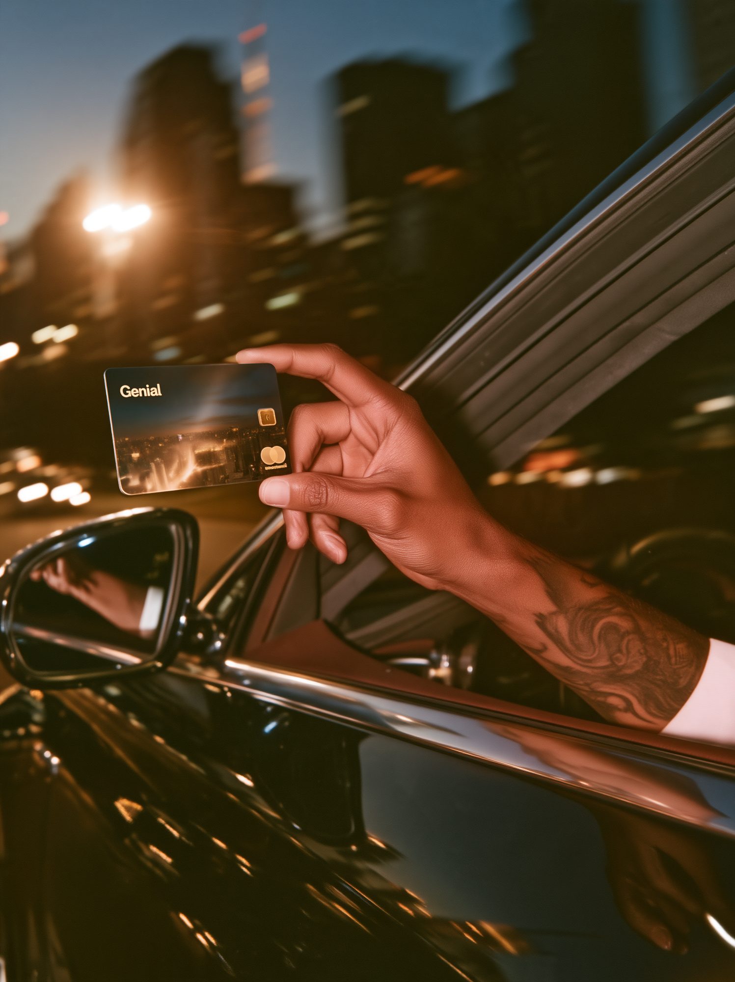
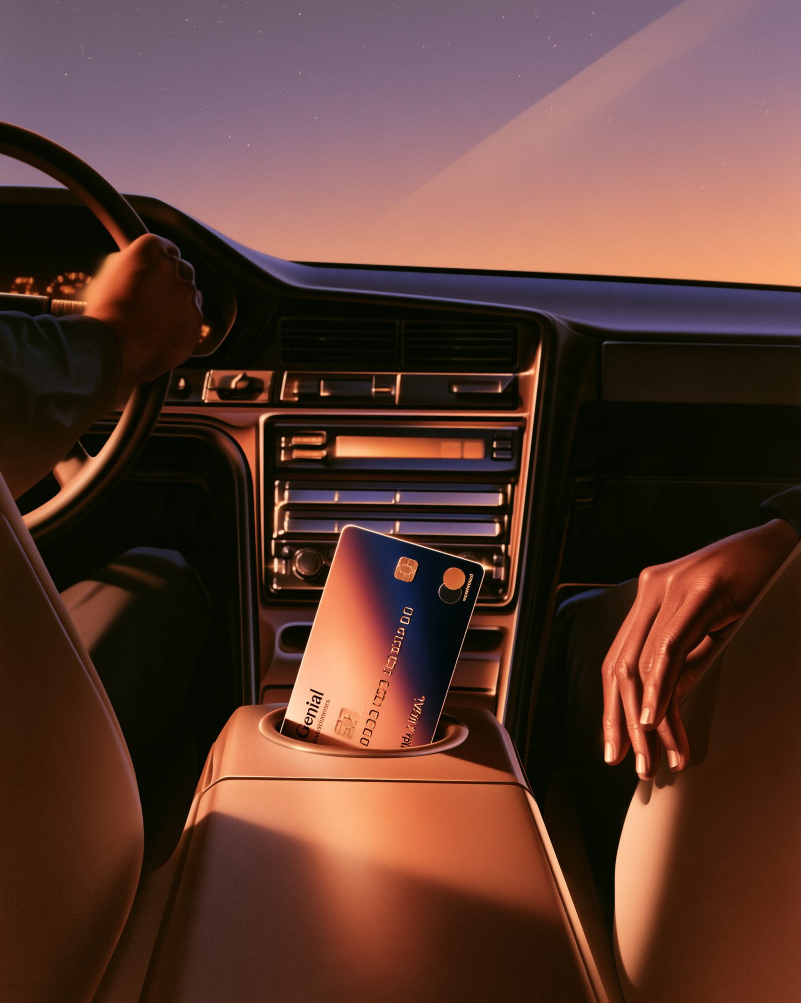
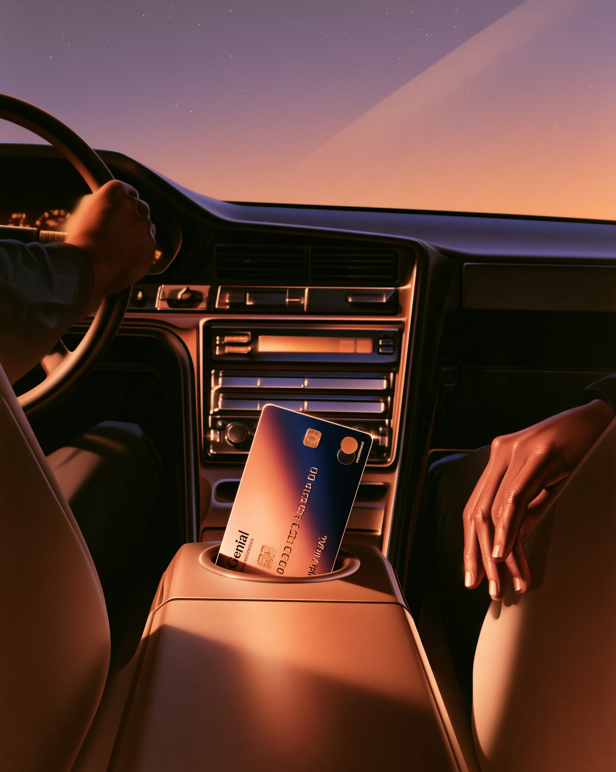
The work began with market research and a design benchmark of the cards already in circulation, with a specific question in mind: which colours draw attention, and for whom. The answer was age. Younger customers leaned clearly towards neon, while preference moved towards restraint as the customer got older. Rather than choosing one audience over the other, the card resolves the finding as a gradient. The navy blue that anchors Genial's palette is the main colour and holds the card in the hand; the surface then moves through warmer, brighter tones, so the same object reads as sober from one angle and vivid from another. Elements from the app and the digital world were brought onto the physical card within the constraints Mastercard imposed, so screen and plastic belong visibly to one system.
The card was only the most visible part of the project. The full experience was designed around it: requesting the card, the credit analysis behind the decision, the digital cards that arrive before the physical one, and the logic of limits, how a limit is set, how it can be moved between users, how it can be shared inside a family, and how a dependent card works. The unboxing was treated as a moment of its own, since the arrival of the card is the first physical contact the customer has with the brand. A social-media strategy was built around that moment so the card would travel beyond the customers who received it.
The launch positioned investment as a lifestyle rather than a spreadsheet. The card was campaigned in prime time on Brazil's largest broadcaster, and the imagery followed the object: the card at dusk, in the centre console of a car, in the same hour and the same palette as the gradient itself.
03. The Results
Genial entered the credit-card market with a product that was coherent from the plastic to the app: one palette, one set of rules for limits and family cards, one register of imagery from the unboxing to television. The colour research gave the company a reading of its own audience by age that outlived the card and informed how it spoke to future customers, and the card itself became the object through which Genial began to present investing as part of everyday life rather than a service used from a desk.